Sunday, 27 September 2009

Found it.

One thing i regret, is not buying the economist when this was it's front cover.


I love it for nerdy reasons mostly.

He looks like a superhero.

Except he's better than that.

He's real, with a real cause.

His mask represents the face of every Iranian fighting for an uncorrupt government.

And its just a simple piece of coloured cloth.

Saturday, 26 September 2009

Stagnant times


I liked this video when it came out in 2002.

I still like it now.

This video I think was ahead of its time.

I think it'd fit in now.

Saying that, I think its past it's date too.

The animation is like the super nintendo system of the 90's.

So is this ahead of it's time or past it?

The same applies to a lot of things right now (for example fashion).

Are we moving forward by moving backwards?

Or are we in the age of the Tribute?

Couldn't agree more.


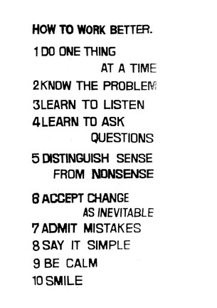
... Except with 5...

You can't really admit to 7 until you've dont a bit of the latter in 5.

Monday, 21 September 2009

Mr. W


I think the reveal needs to be made a bit more obvious, but it's a great idea, and its been beautifully executed.
(Except for the bit where they use Times New Roman!)

Dixons


On my way to work I saw this at both Caledonian road station and Holborn station.

My favourite thing about this is it's strap line: 'The last place you want to go'.

My least favourite thing is 'most happening department store'.
(It just makes me think of Mrs. Doubtfire.)

It's got a nice cheekiness.

The other two in the campaign are fine too, except they're pretty much exactly the same.

Sunday, 20 September 2009

Modern times

Shouldn't it still be this way?


Good animation, good atmospheric music, and universally understandable.

You know what made Charlie Chaplin so successful?

He spoke a universal language.

Amazing that in these times when the world is closer than ever, we don't create so things can be universally understandable.

Saturday, 19 September 2009

Coke Can Improvement Idea's

So i've been thinking about these Can's recently, and i had 2 thoughts on improving them.

Photobucket

1. Look at that can above.

It looks cold.

See how when it's cold, it looks matte?

If they used a matte varnish on their cans, their cans would always look cold and appealing.

Matte looks cold.

Gloss is Shiny.

Shiny looks hot.


2. Now look at where the logo is positioned.

It's above the ring pull.

When you drink from the can, your hand will obstruct anyone from reading it because your going to hold it so you can drink it, not so you can show off the brand.

If they put the brands to the left and the right of the ring pull though, no matter left or right handed, the brand will always be exposed.